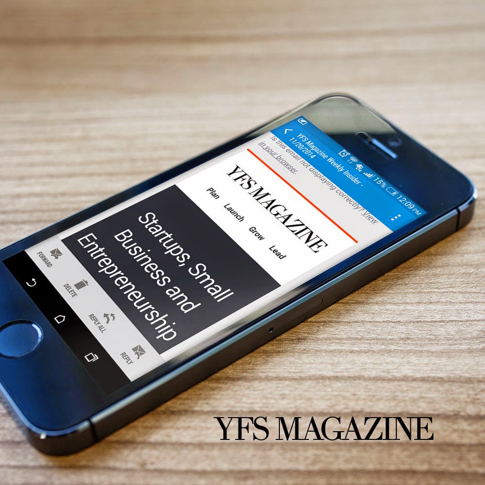
1. Inboxes are cluttered—your newsletter shouldn’t be.
In retrospect, our old email newsletter was cluttered. When thinking about our email redesign we opted for a more minimalistic approach, which included more whitespace, better typography and less color. Steven Bradley does a great job explaining the concept: “Minimalism aims for simplicity and objectivity. It wants to reduce works to the fundamental, the essential, the necessary, and to strip away the ornamental layers that might be placed on top.” Less is definitely more when it comes to email. Many businesses are guilty of trying to cram more than one marketing message into their email marketing campaigns, but focus drives metrics. Our minimal design approach ended up being easy on the eyes and beautiful across all devices.
2. Bring sexy back with thoughtful email design.
Our minimal email design focuses on key elements, all with the same underlying principle that less is more. We added blocks of neutral color to help break up the newsletter into sections that are easy to distinguish. And the color scheme makes our weekly newsletter, as a whole, look cohesive. When recipients open our emails we want them to think, “fresh and clean” instead of “overwhelmed and cluttered”. One of the most important things you can do (with any marketing communication) is to stay on brand … simple is in fact, sexy.
3. We’ve got mobile on our mind and so do your customers.
As Forbes contributor Katie Lee explains, “If a campaign doesn’t show up on mobile devices, it’s not going to perform very well.” We’re on-the-go, and so are you and your customers. Mobile is no longer a nicety, it’s a must-have. We’ve adopted the philosophy, moving forward, that everything we send should be mobile-friendly. “63 percent of Americans and 41 percent of Europeans would either close or delete an email that’s not optimized for mobile.” (Source: Forbes) These stats speak volumes.
4. Subject lines must be short and relevant.
Once we clearly defined our primary goal for sending email, we rethought our subject line. As a consumer, we’ve all seen wordy, misleading, and lengthy subject lines that made our heads hurt. So, we opted for a “simple” cut to the chase approach. An email marketing rule of thumb is that you should keep your subject line to 50 characters or less. (Source: MailChimp) Also, since our free Weekly Insider is delivered on a weekly basis we added a date to the subject line for easy cataloging and reference. Keep in mind, your subject line is highly dependent on my next lesson learned – content.
5. Create compelling and focused content.
“One of the biggest problems with email newsletters is that they are often cluttered and unfocused because they are supporting every aspect of your business.” Our email strategy will continue to evolve, but it starts with the notion that there are several different types of emails to share. From newsletters, to digests, dedicated emails, lead nurturing, sponsorship, transactional, welcome, advice/educational, testimonial, surveys and more – it’s important to decide which communications work best for your audience and deliver focused content, respectively. HubSpot, a great resource for marketers, goes into detail here.
6. We’ve got a lot of personality and it starts with a brand voice.
When I launched YFS Magazine in late 2009 it had a very specific brand voice (I think “Young, Fabulous and Self-Employed” spoke volumes). As we’ve evolved into a global platform for entrepreneurs, our reach expanded and our voice matured. In essence, it has remained true to its brand roots: making entrepreneurship accessible with an authoritative voice and selectively optimistic view of startups and small business culture. To share this personality with readers, we’ve added a publisher’s note to our newsletter, which I will pen for the foreseeable future. My goal is to highlight key trends and insights we’re seeing across the ecosystem and stay in touch. It’s a simple way to steer clear from boring and remain relevant. Also, we endeavored to write short, strong copy—because there is beauty in getting to the point, especially in email.
7. Remind people that you’re social.
In our freshly-minted newsletter we place a high priority on social. Not only did we link to our primary social networks, we also included social sharing buttons for every article to increase engagement. Did you know? “Options to share on social platforms generated a 115% better CTR (click-through-rate) than emails with no options to share the message.” (Source: Socialfresh) This in itself is reason enough to empower people to share what resonates. Social is still an incredibly viable and cost-effective way to grow your business. Email is no exception.
8. Metrics are in the overlooked details.
Pay close attention to the details. From design to deliverability, branding, social and more. The smallest details can go a long way. For example, we had never given much thought to email preheaders—until now. It’s the first thing you read after the subject line and it gives a quick summary of what your email is about. For example, “in Gmail, it is the first line of text that follows the subject line in the inbox view.” (Source: Email Design Review) Most importantly, it boosts the subject line and delves deeper into what your subject line doesn’t say. Also referred to as the “Johnson Box,” these 30 characters actually raise open rates and click through rates on mailings. Who knew?
Source : http://yfsmagazine.com/2014/11/20/email-marketing-8-practical-lessons-learned-from-our-newsletter-redesign/2/
Tags : email marketing, email marketing malaysia

No comments:
Post a Comment